By Michael Bevilacqua
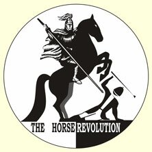
With the release of the Equestrian Sport Photographic Documentary there was some feedback regarding the Horse Revolution logo. Since there is a ‘rider’ on the horse, some people found it confusing or inappropriate given that Alexander no longer rides and as such does not expect members of his school or the HR organization to do so. This decision regarding riding is solely based on the welfare of the horse. The logo existed before this evolution within NHE and the basis of the logo existed long before that.
Alexander’s passion for old school Haute Ecole helped to choose the logo which he placed in his manege. It was two horse heads back to back complete with bits and reins. With the creation of NHE, he decided that his personal logo choice should be changed to reflect his own philosophy. Therefore, the bits and reins were removed from the logo. It now exists as we know it today.
The HR logo has greater significance. The image of St-George slaying the dragon is very powerful in Russia. The logo used by HR went through a couple of changes over the years. However, it still represented a play on the image, or, a reversal of roles. The main reason being that the Russian branch of the Equestrian Federation used the image of St-George slaying the dragon within their own logo. To represent HR victory over equestrian sport, HR initially put the dragon in the saddle slaying the human. That changed to a closer version of the original and how it exists today.

It is important to understand that this is not a literal depiction. Although the image may appear somewhat disturbing, it is symbolic. It is always meant to represent the allegory of St-George’s victory over the dragon. This image is not only common, but iconic in Russia, as well as, elsewhere in the world. It is part of the coat of arms of Moscow. Further information can be found here:http://en.wikipedia.org/wiki/Saint_George
The picture used as the HR symbol does not depict Alexander, or any member of HR or the NHE school. It remains a well-understood and important, powerful symbolic depiction representing our cause against violence in equestrian sport. The roots of which come from St-George slaying the dragon. Since it is not meant as a literal representation, there are no plans to alter the logo. We appreciate the feedback from forum members and non-members alike regarding the logo and the ES photographic documentary.
This entry was posted at 17/06/2010 on 4:06 am and is filed under: Horse Revolution.


